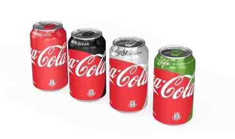
Coca-Cola Reveals New “One Brand” Packaging

In a move that aims to extend the company’s “One Brand” global marketing strategy to packaging, Coca-Cola has announced the launch of new graphics that use one visual identity system featuring Coca-Cola Red as a unifying color across the trademark.
The Red Disc, the signature element of the new “Taste the Feeling” global creative campaign launched in January, will now appear prominently on packaging. The new packaging is designed to enable consumers to choose the Coca-Cola that best suits their taste, lifestyle and diet.
To clearly identify each product, the signature color is featured throughout the packs – black for Zero, silver for Light / Diet and green for Life. The new graphics will also include the unique product name and benefits on front of pack to help consumers make an informed choice.
[ Helen Price Named President of Coca-Cola Foundation ]
The new packaging graphics were revealed at an event on Monday to celebrate the roll out of the “One Brand” approach in Mexico. New packaging will be available in stores in Mexico the first week of May. Similar versions of the Red Disc graphics will roll out into additional markets around the world throughout 2016 and into 2017.
The company recently announced the launch of the “One Brand” approach, which extends the global equity and appeal of original Coca-Cola across the trademark and is designed to enable consumers to choose whichever Coca-Cola suits their taste, lifestyle and diet.
In support of the strategy, the company unveiled “Taste the Feeling”, which is now live in 195 markets and includes 12 television commercials – three that debuted for the first time in Mexico: “Professor”, “Empty Bottles” and “Antarctic Summer” – in addition to more than 100 campaign images, a visual identity system and a music anthem and audio signature.


